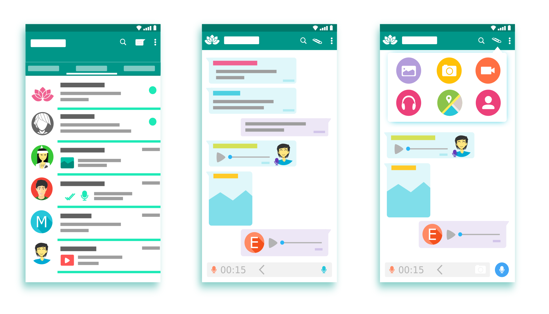
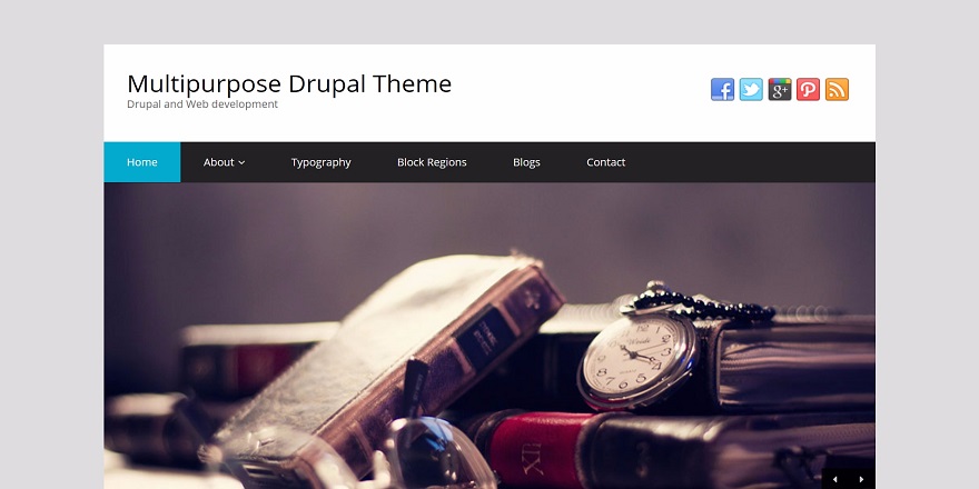
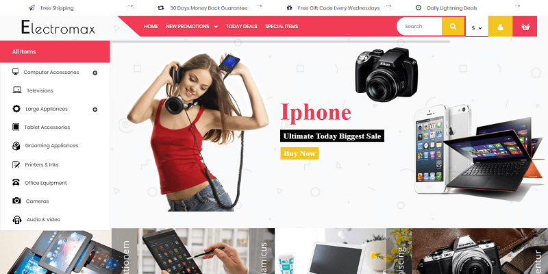
Following the top trends in app design is necessary. If a company wants to have plenty of users and engaging followers, they need to step into the shoes of the newest trends.
But, how can you know what will be popular next week, month, or even a year? Especially when it comes to styles of trends in app design. You can do that simply by observing and knowing your target audience. Nevertheless, there’s so much more than that.
In order to ensure a profitable project, successful trends in app design are essential. There’s far more to it than just a draw or a sketch of an icon or a button. Actually, a ton of underlying factors are behind, like art, psychology, behavioural analysis, and testing.
Besides the fact that security is important for conversions since there are applications that leak your information, the app design is still the first thing that your future user is concerned about.
To make sure you and your company are at the top of your service, let’s dive in and check the latest approved trends in app design 2024!
1. Minimalism and Simplicity
Too many buttons, stickers, colours, and text are way in the past. The fewer things we have in our app, the better. Nobody wants to see the overclocked landing page, let alone if used for purchasing. The client will instantly turn the app down and your work is over. There’s nothing much else you can do at this point. Every business holder wants to avoid that.
So, keep it simple and clear. These types of designs are usually intended for mobile apps due to their limited size. And the best thing is that customers actually proved that they love it!
Information that they will need is easier to comprehend and the usability of the app is much more functional.
When we say minimalistic design we mean: Fewer colours with simple and basic shades, and a lot of free space The navigation should be straightforward, with the exact information needed.
Having a unique yet modern style is what matters, but to stand out from your competitors, you will need more than that. Knowing the basics of ASOand implementing the services like OTT Platforms you can improve your online presence and increase the visibility of your app.
2. Dark Design
If you are a user of any social media accounts, you have probably noticed the dark-mode option. And this is for a reason because it has proven to be one of the best UI experiences.
Users are massively changing to the dark more option because it reduces eye strain plus it’s saving your battery’s life.
But that’s not all. With the dark theme, your app and your user profile look more classy yet each detail is clearly visible. It’s not going out of style anytime soon.
3. Neumorphism
We know, it sounds a bit strange but we will explain. So, we are aiming to have a minimalistic design, but we don’t want our appearance to look bored, right? That’s why we can make it neumorphismastic. We are reviving trends and styles from 10 years ago, and we’re giving it a simple makeover with a dash of 3D graphics.
By taking flat icons and applying this “technique”, we are getting a new design of dimensional appearance. And what do we get?
We get a simple and flat cartoon-ish design with an impressive amount of realism that makes the icon “pop from your screen”. This 3D-like appearance will give a realistic effect and make the design incredibly modern.
4. Depth Effect
If you are unable to make this eye-popping appearance, use the depth effect. This means that if things can’t go front, push everything in the back. You have probably already seen this, and it looks fantastic. Also, it’s not even that hard to achieve it, all you have to do is use shadows and layering techniques.
By adding layers to your icon where the elements are overlapping, you can easily make a similar effect as with a 3D-like design. On the other hand, creating shadows and adding contrast to the elements is an easy way to accomplish the visual in-depth effect.
Or, if you want to experiment, you can even combine these two! Put some shadow on your layers and experience the latest app design trend.
5. Newest Fonts
The rule of minimalism applies to typography as well. We have seen that the fonts are changing from year to year, but a few of them have been massively used for one of the most creatively designed apps.
Today, in the year 2021 this minimalistic trend is on the top of the design world. Therefore our copy, our text, and everything related to typography and its style should be as simple as possible yet match the overall design of the app. That’s why we have Serif fonts to cover our modest needs.
The variety of this font can make your app attractive and memorable. On the other hand, it can convey the essence of the digital product. That’s why the Serif Fonts became one of the most popular trends in the design world.
6. Gradient Colors
We know, gradient colours don’t really match with flat designs. Yet, in the year 2021, everything is possible. Using bold and gradient and even neon colours combined can bring the real futuristic look.
If you have a good designer next to you, this can look hella impressive! Actually, gradient colours give you a lot of possibilities in the creative process, so no wonder they are still trending. Mixing these colours can give your app a modern, unique, yet cutting-edge design.
But pay attention to some details. When creating a perfect palate, avoid monotonous gradients but look out for more contrasting colours and their combination. This will give a more innovative look where the icons and other elements will stand out perfectly.
7. Analog Style
Nope, we are not using analog technology again, but we do find inspiration in it. We already mentioned that we have to be modern, right? The style, the trends, the innovations.
They are all important. But this doesn’t mean that the old things can really be gold. With a dash of a makeover, the design can have the back-to-the-future look.
Analog inspiration can really do miracles when it comes to placing new trends. The design with this look really brings out this nostalgic analog style and leaves a kind of warm feeling.
These are usually more yellow-ish colours rather than pure white with cardboard texture. The analog style is inspired by collage layouts, retro fonts, and old-type button designs.
8. Artificial Conversational Entity aka Chatbot
Interactive agent, IM bot, chatbot, or call it however you want, is a form of digital communication and the latest trend in 2021. But, this trend first showed up in the 2000s and made a big deal back then. Today, it has many advanced features with great outcomes.
Having a chatbot is a big plus for customer support and other client-related stuff. Imagine if the user visited your site and can’t seem to find the Contact Us button. Or maybe doesn’t like calling or waiting for a response via mail. Instead, there’s a little chat box, where the real-time people are behind, waiting for customers’ questions to pop up. With one assistant always online, the response is immediate.
This can significantly improve the relationship between you and your clients while giving high-qualitycustomer feedback and support. The chatbots are still in the development process, and there’s no doubt that they are a current and future trend in the IT world.
9. VR and AR in UI Design
In the time of lockdowns and self-isolation, virtual and augmented reality become must-haves in our homes. So, business holders, are you sure you want to avoidapp data breaches? This was a huge trend in 2020. but it will continue to be in this and upcoming years for sure.
That’s why designers and app developers need to prioritize the display quality of AR elements. Interface design that has augmented reality, is crucial for designers who are thriving for new trends.
With this design, the customers will have the feeling like they are inside the app. It’s almost like the app is drawing you into using or playing it. The augmented reality has an engaging yet simple design, necessary information, which gamified the whole experience.
Online purchasing is the trend of our century. So, imagine if you could provide your customers with the real experience of the goods online. For instance, seeing how furniture looks in the corner of a room, or how the simple mobile app lets users try on clothes.
Pretty tempting, right?
10. Irregular lines
Perfect lines, perfect angles, straight fonts, all that are in the past. The newest trends in app design are right that – irregular and unexpected lines.
This type of design is the exact opposite of what we are used to. The unusual angle of the element or the background that is not in the “right” line, is what draws users’ attention.
This will give the modern, innovative, and dynamic look, plus it’s a perfect way to break through and stand out from the traditional design thinking.
Summary
If you want to be modern, you have to follow the trends in app design. If you implement those trends into your services, you are going to have the best results.
This sounds so easy, so simple, and 100% not true. Each trend is unique in its own way, it has good sides but bad sides as well. If something is trends in app design world it doesn’t necessarily mean that is good, but it is what people are searching for.
The trends in app design for 2024 are just the right thing. We took a few old but gold rules and improved them. We changed the fonts a little bit, we were more modest about the colours, and we were thinking outside the straight lines. Resulting in trends that cannot be ignored, but rather accepted in each and every area of the app design world.
Author:
Nina Petrov is a content marketing specialist, passionate about graphic design, content marketing, and the new generation of green and social businesses. She starts the day scrolling her digest on new digital trends while sipping a cup of coffee with milk and sugar. Her white little bunny tends to reply to your emails when she is on vacation.


