Do you want to know what are the use cases of Angular Charts? If yes, then the answer to your question is here so keep reading.
An angular chart is a data chart written in angular.js for data analysis and interactive visualization.
Businesses of any size use them to make strategic decisions and understand large amounts of data in an interactive way. They can create pie, column, area, line, radar, Marimekko, and over 150 Angular charts examples whenever infused in any web application.
This post will examine what angular charts entail and the various use cases.
What Are Angular Charts?
Angular charts are data charts coded in angular.js and used to create interactive charts, graphs, and maps for data visualizations in any web application.
You can program them from scratch or develop them using numerous Angular.js chart libraries such as FusionCharts, Ngx-charts, Ng2-charts, and Google Angular Charts.
Use Cases of Angular Charts
Now, let’s look at some of the best use cases of angular charts.
Pie Charts
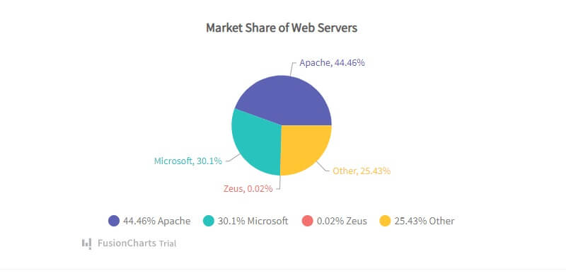
Pie charts split and represent data values into several pieces of a circle to illustrate numerical proportions.
Each section represents the size of the data value and you can further measure each section with a proportional percentage.
While the circle represents the whole data group, each pie slice is relative to the size of a particular data value in a group.
Use Case: Angular pie charts are used to show percentages while representing a data value as a composition of a group. For example, the chart below illustrates web servers’ market share.
Simple Column Charts
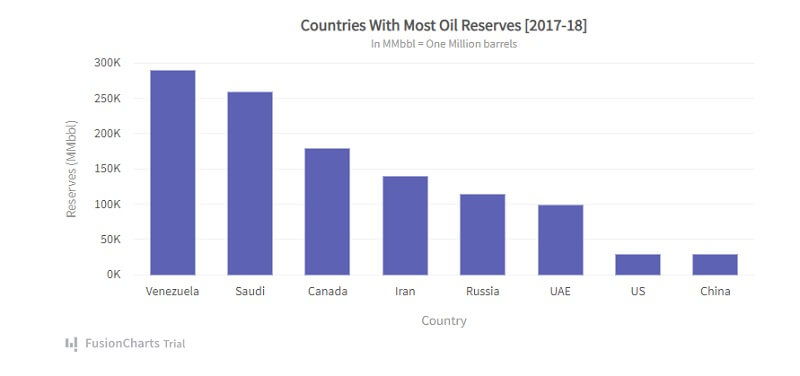
Column charts use vertically aligned rectangular bars plotted against the data values on the other axis to visualize comparative data.
It mainly shows and represents data value changes over time, such as year-on-year store sales or monthly rainfall volume.
Use Case: A particular use case of the Angular column chart by FusionChart is this illustrative chart showing countries with the most oil reserves.
Line Charts
A line chart would be the most appropriate when you need to visualize data over a continuous period.
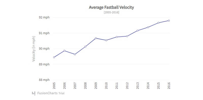
Line charts represent data or visualize a data trend over time. To create a line chart, you plot data values against time and connect the points to form a line segment.
Use Case: An example is this line chart by FusionCharts, visualizing data of the average fastball velocity from 2005 to 2016.
Line Charts With Multiple Series
Just like line charts, Line charts with multiple series visualize trends in one or more datasets.
The chart displays continuous data values represented by points over a period of time. While you use line segments to connect these points, each point represents a single value.
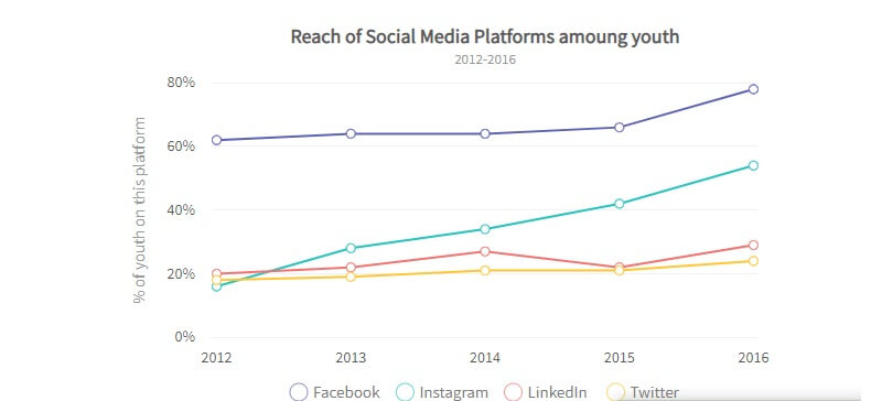
Usually, the vertical axis on the left shows the data set, while the horizontal axis displays a time series. Plus, you can use multiple data sets on the chart and render multiple line segments for comparison.
Use Case: For example, this line chart with multiple series shows the reach of social media platforms among youth between 2012 and 2016.
Area Charts
Like line charts, Area charts usually have data values plotted and connected using line segments to form an area.
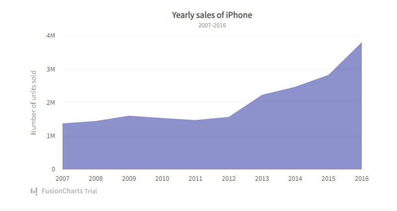
To represent the change in that period, you fill each area segment (the area between the line and axis) with varied colors.
Use Case: Area charts are appropriate when you want to visualize change in one or several quantities as a result of time. For example, the chart below that shows the yearly sales of iPhones from 2007 to 2016 is a clear use case.
Area Charts With Multiple Series
Area charts with multi-series showcase point that you connect through line segments to form an area.
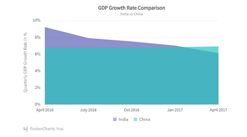
This chart visualizes the amount of change of a variable during a period while comparing it to another entity. Every dataset has an area filled with unique colors between the line segments and the x-axis.
Use Case: This chart compares datasets of two separate entities. For instance, an example is this chart comparing the GDP growth rate in India and China.
Stacked Column Charts
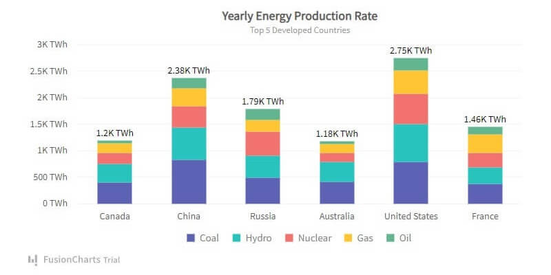
Stacked column charts compare multiple data sets and illustrate the quantity of each element.
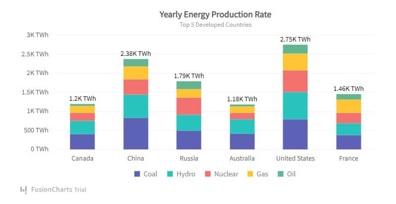
The chart contains stacks plotted vertically in a column on each other to illustrate the numerical value of multiple data sets.
Datasets are proportional to the length of each stack in a column. Plus, each stack is unique by its color. And to illustrate each stack to its corresponding data categories, you render an icon legend.
Use Case: The stacked column chart is widely used when comparing data sets of different elements in different regions. For example, the chart below shows the yearly energy production rate for different energy sources in the top 5 developed countries.
Simple Bubble Charts
Bubble charts represent and visualize datasets with three numeric variables.
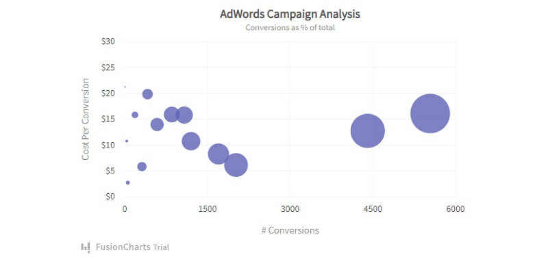
While the first two variables plot the point on the vertical and horizontal axis, the third variable represents the bubble’s diameter. In this case, you illustrate a large third variable by a large bubble and vice versa.
Use Case: Mostly, bubble charts are used for comparative analysis between two elements through the bubble size and position. For instance, this conversion chart shows the conversion rate for various AdWords campaigns against cost.
Bubble Charts With Quadrants
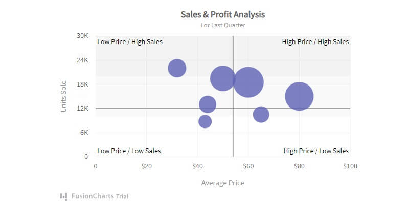
This is similar to simple bubble charts and comes with four quadrants. For this chart, you visualize data and define them by three numeric variables. These variables are represented by points on the horizontal axis, vertical axis, and bubble diameter.
Use Case: The chart compares and illustrates relationships between multiple variables using bubble size and position. For example, the chart below compares sales and profit analysis, comparing the price to units sold in a quarter.
Simple Scatter Charts
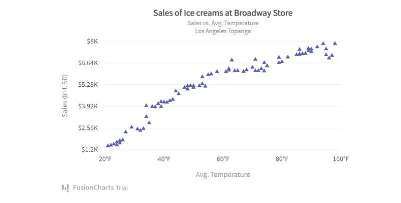
Scatter charts illustrate the relationship between two variables plotted on each axis using cartesian coordinates.
The intersection of each point from the two variables is marked on the chart.
Use Case: The chart visualizes and deduces how one numerical variable impacts the other. For instance, the chart below visualizes the comparison between ice cream sales and the average temperature in the area.
Frequently Asked Questions (FAQs) on Angular Charts
What is an Angular Chart?
Angular Charts are used to create beautiful and interactive data visualizations for easy analysis. You can either program these charts in Angular.js from scratch or with Angular chart libraries.
Which chart library is best for Angular?
Several chart libraries are available for producing beautiful and interactive Angular.js charts. Some of these include FusionCharts, Ngx-charts, and Ng2-charts. FusionCharts is a powerful JavaScript library for building Angular charts, graphs, and maps.
What are the 5 types of charts?
Five basic types of charts used for data analysis include line charts, area charts, column charts, pie charts, and bar charts.
What type of chart is best?
To determine which chart best suits you, you must consider the data presentation type (comparison, composition, distribution, or relationship), the number of variables to show, and the number of data points for each variable.
Conclusion
To sum up, Angular charts make it easy and fast to develop beautiful and interactive charts for data analysis.
They have various use cases and presentation types, whether comparing monthly product sales or inspecting the usage from multiple energy sources in multiple cities.

