In this article, We will help you with our best-recommended effective brand identity examples. These days, the business environment is just too competitive. As more people switched from working for organizations to starting their businesses following the epidemic, the number of firms—which was predicted to be over 333 million in 2021—has only increased.
Simple marketing strategies are insufficient in this fierce competition. All is not lost, though, since there is a method to stand out among the throng.
You must develop your brand’s identity.
Developing a strong brand identity is crucial to effectively expressing your company and establishing a connection with your target audience. This post will go over all the specifics on how purchasing significant digital assets may help you develop a unified brand identity. Let’s investigate them further.
Brand identity: what is it?
A human identification document is similar to a brand identity. You are unique from other individuals because of things like your fingerprints, home address, phone number, and picture.
Similar to this, a business has to differentiate itself from the competition using a distinct collection of visual components or graphic representations.
A website, a logo, social media postings and channels, brand colors, and much more are all part of an unforgettable brand identity. It also covers things like business card designs and typefaces utilized.
Differentiating between a brand and its identity
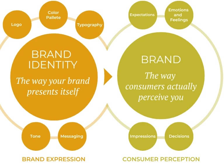
But you have to be careful not to confuse this with the brand itself. A brand is distinct from a brand identity since it is predicated on the sentiment that your target market feels about your business. It all comes down to how your brand’s visual identity makes the consumer feel.
Developing a strong brand is essential for success in the commercial world. For individuals to become devoted clients, you need them to have strong feelings about your business. It takes all the components of a brand identity to create a brand. Additionally, you need brand assets to develop your brand identity.
Branding resources
The components of a brand identity, such as logos, films, images, taglines, slogans, noises, and other visual elements, are known as brand assets.
For instance, Apple features a distinctive font, a gray color scheme, and a unique logo depicting a half-bitten apple. Individuals line up for hours to get their hands on Apple products because they view the company’s emblem as a status symbol.
What should your brand asset kit contain now that you understand the importance of having a brand identity? The following is a list of some of the most significant brand elements.
Business symbol
One of the first and most crucial brand assets you should build up is most likely a logo. It is a visual reflection of your complete brand and should preferably be straightforward and uncomplicated rather than intricate and sophisticated.
Before expressing to a designer the requirements for your logo design, keep the following elements in mind:
- Avoid overdoing the font or backdrop;
- Avoid using floral backdrops and lettering that is difficult to read.
- To ensure that people can see the text well and without straining their eyes, the background and text colors should complement one another;
- A logo should have a plain backdrop and a basic typeface that is readable by anyone.
- Take your time when selecting the colors for your brand logo since applying those same colors across your organization will help it become more remembered.
Although a logo may be used for a variety of purposes, it is preferable to have something that will continually and instantly remind people of your business. The enduring Nike swoosh is an illustration of a distinctive and instantly identifiable logo.
You may either utilize a basic logo creation tool or pay a designer to develop a logo for you.
Fonts or typography
People’s emotions may be seriously triggered by typefaces, thus it’s important to select fonts that complement your company identity.
The tone of your brand also affects the typefaces and typography you use. A simpler typeface won’t work well for a premium business; instead, aim for a fancier one. Similarly, for a brand that is associated with food, you may pick some playful typefaces. You understand.
This does not imply that you must only utilize one font family for all brand-related projects; rather, you should stick to it. Every typeface that goes well together is part of a font family.
Palettes of colors
Ensuring the buyer begins to associate those colors with your business may be achieved by using a consistent color palette throughout. Ideally, customers will think of your business anytime they come across comparable colors. Being in people’s thoughts is excellent marketing as it serves as a reference and generates a ton of business for businesses through word-of-mouth.
Numerous aspects might influence the color scheme you select, but some hues are well-liked and frequently utilized in the business sector.
- Many of the most successful businesses, including Facebook, Twitter, LinkedIn, and others, use blue as their primary color.
- Food-related businesses, on the other hand, typically use more enticing and appealing colors, like red, yellow, orange, etc.,
- While businesses attempting to position themselves as luxury brands, like Apple, typically choose black or gray tones.
This does not imply that you cannot utilize blue if a profitable business already does. While you can utilize the same hue as another brand, your color scheme should be unique throughout. It’s important to be original in how you apply the colors in your color scheme.
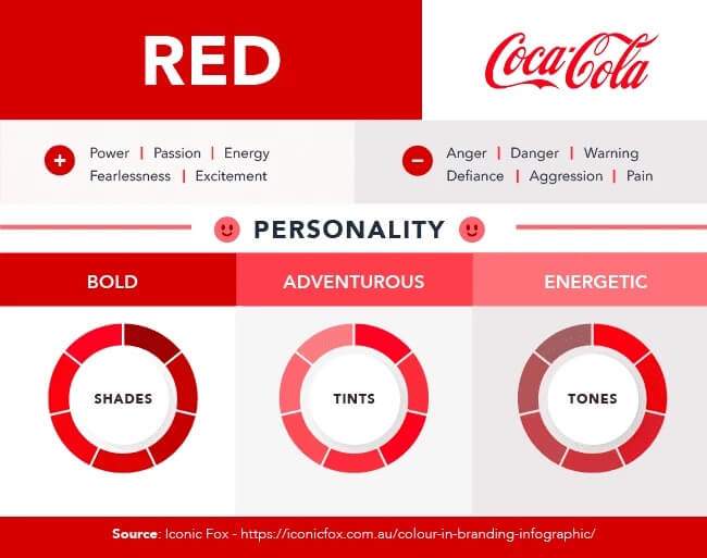
Consider the brands McDonald’s and Coca-Cola. Although red is a part of each of their palettes, the shades of that color vary. Additionally, the precise hue varies. Thus, bear it in mind while selecting a color scheme.
When developing color schemes for your company, keep in mind that 9–12% of consumers have dyslexia, and 2.2 billion individuals globally have visual impairments. You may ensure that your material is readable by all users by using resources such as Colorable, Contrast Checker, and the Disability Simulator Chrome add-on.
Sentiment and Wording
A brand voice is formed by the combination of your messaging and tone. For a unified and complete identity, aim for a distinctive voice that truly captures the essence of your business.
Choose terms that complement the mood you wish to establish for your business to create a cohesive brand voice. What kind of tone do you want for your brand—ethereal or powerful? What kind of tone are you looking for—serious or quirky?
Dove is a perfect example of a strong brand voice. They provide a positive and inspiring message of acceptance and self-love in the beauty business, demonstrating the brand’s dedication to both its clientele and its ideals. Conversely, Skittles is a fantastic illustration of a brand that has a lighthearted and enjoyable tone. Whether it’s in their advertisements, social media postings, or slogans, their message is consistently irreverent.
Design of Websites
Approximately 2.14 billion individuals make purchases online, in keeping with information. Nowadays, the majority of individuals use the internet to do studies earlier than choosing a course of action. Apart from social media, evaluation websites, and different platforms, agencies in general use an internet site as considered one of their primary gear to connect to clients.
Individuals who click on an internet site seldom stay on it for lengthy, so you want to have an attractive design that entices traffic to maintain exploring. The person interface wishes to be simple, tasteful, and smooth to apply. It is most popular to have your website’s colorations coordinate with the shade scheme you’ve decided on for your commercial enterprise.
Using consistent fonts and colors for graphics and voice across social media platforms and email marketing tools like Sender is also essential. Gaining the trust of consumers and sustaining brand consistency will be simpler as a result.
Slogan
What comes to mind when you hear the phrase “it’s finger-lickin’ good”? Yes, this KFC slogan has been ingrained in our thoughts forever. When such words are spoken, it’s nearly hard to think about anything else.
It’s amazing how a single line of wordplay can establish an unrivaled brand voice. That is how taglines work.
You have to think of a tagline if you don’t already have one. Like no other resource, slogans have the power to evoke feelings and forge relationships with people. Catchy phrases tend to stick in our heads, much like poetry we learned in nursery school.
Follow some other companies’ leads that have memorable taglines. For Apple, “Think different,” L’Oreal, “You’re worth it,” and Nike, “Just do it.”
These slogans are shockingly straightforward. It’s not necessary to think up witty sentences or distort words past recognition. You must come up with something so straightforward and unforgettable that it will stick in everyone’s memory.
See these examples of brand identities for inspiration.
1. Coca-Cola
“Real magic” is the tagline.
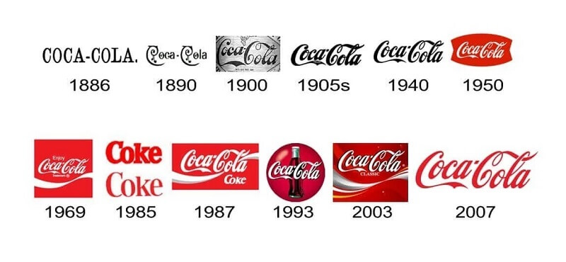
This is a perfect illustration of how creating a strong brand identity can result in enormous success. Despite changes throughout the years, Coca-Cola has never lost the timeless qualities that set the brand apart and make it instantly recognized.
Their brand’s different typeface and easy crimson-and-white shade scheme integrate to produce one of the most recognizable trademarks ever. No, remember in which you are within the globe, you may recognize Coca-Cola at a look and know exactly what they’re imparting.
Coca-Cola is the market leader because of its well-known emblem that makes people happy everywhere in the international.
2. McDonald
The slogan of McDonald’s is “We love to peer you smile.”
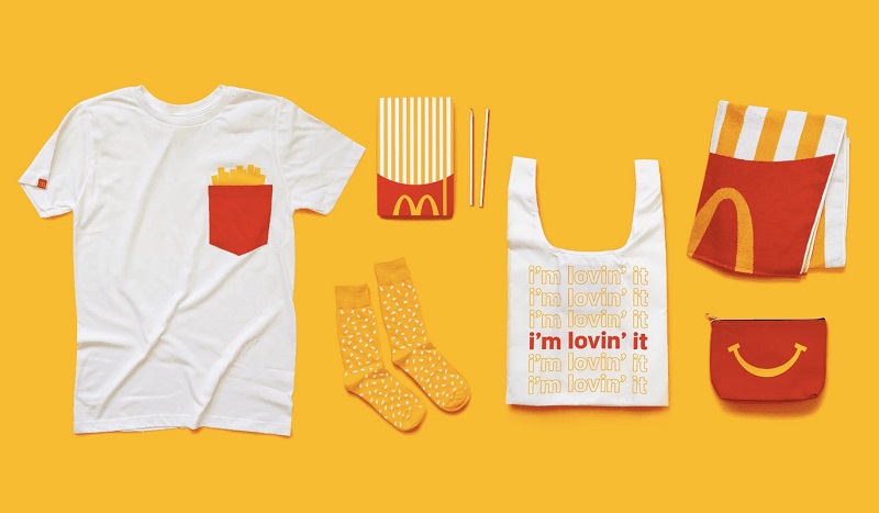
Similar to Coca-Cola, McDonald’s is a famous logo around the arena that, anyplace you see its golden arches, exudes confidence.
This massive rapid-meals chain keeps an exceptional and globally identifiable color scheme of purple and yellow.
Customers of many ages can recognize their enduring M, often known as the golden arches.
They are easily identifiable, but they also do a fantastic job of modifying their brand identity to appeal to various demographics. Marketing pairs characters like Ronald McDonald and the Hamburglar with a monochromatic color scheme and the trademark M to appeal to a variety of consumers, including youngsters (Happy Meals) and those with dietary requirements and cultural diversity. Nevertheless, they are a foundation of continuity, giving customers a sense of security and welcome wherever they go.
3. Headspace
Headspace Slogan: An in-your-pocket personalized meditation guide.
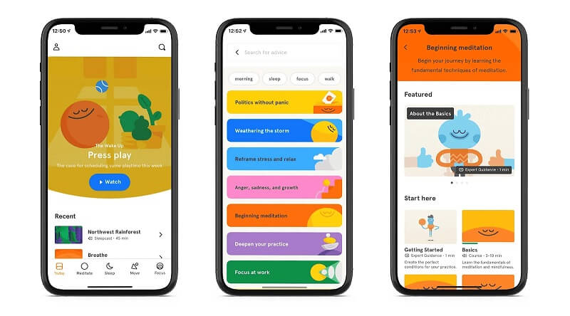
With guided meditation and different mindfulness physical games, the Headspace app was developed to assist users in releasing the anxiety they create around them day by day. They seem to have perfected the artwork of visible conversation even though it could seem tough at the beginning.
Headspace has a straightforward orange dot for its logo and a clean, minimalistic sans-serif typeface for its brand name. This little orange dot may not seem like much, but it symbolizes a focused, peaceful, and tranquil state of mind—exactly what the app seeks to help users attain.
Although people tend to associate blue tones with relaxation, Headspace makes extensive use of color across its website, app, social media postings, and videos. Their cartoon-like visuals make sense with this vibrant color scheme; combined, they elicit enthusiasm and delight in consumers across all of their communication channels.
4. Glossier
Glossier Slogan: Prioritize skin. Second, makeup. Always smile.
Glossier started as a blog called Into the Gloss and evolved into the well-known skincare and cosmetics business it is now, thanks to the devoted fan base they built by being recognized as a fresh and genuine voice in beauty.
Glossier made the wise choice to develop a minimalist brand identity as they understood that the majority of their target market consisted of youthful beauty lovers who chose more natural goods. Their slogan, “Skin first. Makeup second. Smile always,” even more accurately captures their effortless aesthetic. Customers loved this combo as well as their sophisticated packaging and actual skin-based advertisements.
Their emphasis on inclusion and accessibility enabled the business to go beyond cosmetics and become more of a lifestyle brand. Their physical storefronts, website, social media accounts, and advertising campaigns all focus on the basics and let their goods speak for themselves.

Conclusion
Your brand guidelines package should also include a ton of other brand assets, such as email designs, business cards, graphics, and icons. These, however, are the most crucial ones since they will direct the remaining resources for you. Play with the colors and have fun without fear.

