
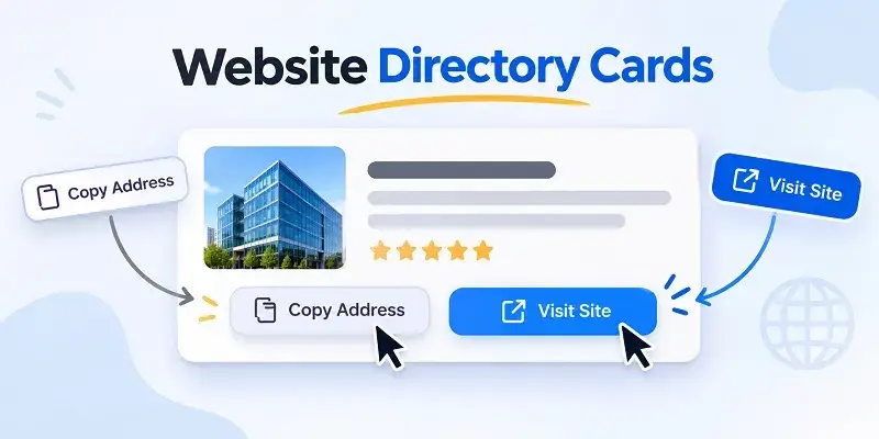
A website directory card often looks simple: a site name, a category, a web address, and one or two buttons. But small interaction decisions inside that card can significantly affect how quickly users understand what will happen next.
One of the most important distinctions is between copying a website address and opening the website itself. These actions may appear closely related, but they serve different user goals and should normally be presented as separate controls.
Good directory design makes that distinction obvious before the user taps anything.
Copying an Address and Visiting a Site Are Different Tasks
A user who selects “Visit Site” expects immediate navigation. The current page may be replaced, or a new tab may open with the destination.
A user who selects “Copy Address” expects to stay where they are while the URL is placed in the clipboard.
The outcome, context, and level of commitment are different. Combining both ideas into one ambiguous button forces the user to guess.
Users Copy URLs for Many Reasons
Opening a site is only one possible goal.
A visitor may want to send the address through a messenger, save it in notes, paste it into a document, compare it with another domain, or open it later on a different device.
A directory that exposes the URL directly supports these workflows without forcing immediate navigation.
“Visit Site” Should Communicate Navigation Clearly
A navigation button should use language that makes the destination behavior predictable.
Labels such as “Visit Site,” “Open Website,” or “Go to Site” communicate that the user is leaving the current directory context.
An external-link icon can reinforce the meaning, but the text should remain understandable without relying on the icon alone.
“Copy Address” Should Not Look Like a Navigation Link
The copy control performs a utility action rather than navigation.
It can therefore use a secondary visual treatment: a smaller button, clipboard icon, outlined style, or text action positioned near the visible URL.
The visual difference helps users understand that clicking it will not open another page.
The Address Itself Has Informational Value
Showing the domain gives users more context before they visit.
They can confirm the destination, recognize a familiar brand, notice an unexpected domain, or distinguish between similarly named services.
For this reason, hiding every destination behind a generic button can reduce transparency.
Card Hierarchy Should Match User Priorities
A directory card usually contains several pieces of information, but they should not compete equally for attention.
A common hierarchy is:
- website or service name
- category or short description
- visible web address
- primary action to visit
- secondary action to copy the address
This structure allows users to identify the destination first and choose an action second.
Category Information Should Be Easy to Scan
Directories become difficult to use when every card appears as an isolated destination with no context.
Category labels help users understand why a site is included and how it relates to nearby entries.
They are particularly useful when a directory covers many subjects such as technology, entertainment, shopping, communities, tools, or information services.
A Category-Based Directory Provides a Useful Reference
A Korean example is boostlink01.com, which presents website discovery around categorized destinations and comparison. The broader interface challenge is helping users distinguish between inspecting an address, copying it for later use, and opening the destination immediately.
Primary and Secondary Actions Should Not Compete
If both buttons have the same size, color, and visual weight, the user may hesitate because the interface does not indicate which action is considered primary.
For most directory cards, visiting the site is the primary action. Copying the URL is useful, but usually secondary.
The design can reflect this without hiding either option.
Button Placement Should Stay Consistent Across Cards
Repeated components become easier to scan when controls appear in predictable locations.
If the Visit button is on the right side of one card but moves below the address in another, users must repeatedly reinterpret the layout.
Consistency matters even more in long directory pages containing dozens of cards.
Long Site Names Can Break Otherwise Clean Layouts
Card designs frequently look perfect with short placeholder names and fail when real content is added.
Long brand names can wrap to multiple lines, push buttons downward, or increase one card’s height enough to disrupt the grid.
Designers should test cards using realistic worst-case labels instead of only ideal examples.
Long URLs Need Their Own Layout Strategy
A full URL may be much wider than the available card space, especially on mobile.
Possible strategies include controlled wrapping, truncation with an accessible full value, or displaying only the relevant domain while copying the complete destination behind the button.
The chosen approach should preserve clarity without creating horizontal overflow.
Mobile Screens Change the Interaction Problem
On desktop, two adjacent buttons can be easy to distinguish. On a narrow phone, the same controls may become cramped or difficult to tap accurately.
Responsive layouts should allow enough spacing between actions so that users do not accidentally open a site when they intended to copy its address.
Touch Targets Need More Space Than Mouse Targets
A tiny icon may be acceptable for a precise mouse pointer but frustrating for a finger.
Mobile controls should have sufficient interactive area even when the visible icon itself is small.
Padding can increase the touch target without making the interface visually heavy.
Stacking Actions Can Be Better Than Squeezing Them
When a card becomes narrow, forcing two controls into one horizontal row can create clipped labels or undersized buttons.
At smaller breakpoints, it may be better to stack actions vertically or allow the primary button to occupy more width.
Responsive behavior should be decided intentionally rather than left to accidental wrapping.
Copying Needs Immediate Feedback
A successful clipboard action has no obvious physical result. Without feedback, users may click the same button several times because they are unsure whether anything happened.
The interface should confirm success with a message such as “Address copied” or a temporary change in the button label.
Feedback Should Be Brief but Noticeable
A confirmation does not need to interrupt the user with a modal dialog.
A lightweight toast, inline message, or temporary state change is usually enough.
After a short period, the control can return to its original label.
Copy Failure Should Also Have a Defined State
Clipboard access may fail because of browser permissions, insecure contexts, or older browser support.
The interface should not silently report success when the operation did not complete.
A fallback can allow the user to select the visible address manually.
Accessibility Applies to Both Actions
Buttons should have clear accessible names that describe their behavior.
An icon-only clipboard control should not rely on visual recognition alone. Screen-reader users need an accessible label such as “Copy website address.”
Likewise, status feedback after copying should be available to assistive technology where appropriate.
Keyboard Users Need Predictable Focus Order
A card may include the site title, address, copy control, and visit control as separate interactive elements.
The keyboard focus order should follow the visual and logical reading order rather than jumping unpredictably around the card.
Do Not Turn the Entire Card Into a Click Target Without Care
Making the whole card clickable can seem convenient, but it creates conflicts when the card also contains a copy button or other secondary controls.
Nested or overlapping click behavior can lead to accidental navigation.
A clearly defined Visit button often creates a safer interaction model.
Hover States Should Explain Interactivity, Not Add Confusion
Desktop users benefit from clear hover states, but every element should not appear clickable if only one part actually performs an action.
The visual language of the card should distinguish informational text from interactive controls.
Dark Themes Need Separate Contrast Checks
Many modern directory interfaces use dark backgrounds with bright accent colors.
In this environment, secondary text, URL labels, borders, and disabled button states can easily become too faint.
Designers should review both the default and interactive states rather than assuming colors that work in light mode will also work on dark backgrounds.
Categories Can Use Compact Visual Treatment
Category labels often work well as small tags or metadata rather than large buttons.
Their purpose is primarily to explain context unless category navigation itself is an intended action.
Avoid making metadata look interactive when it is not.
Card Density Should Reflect the Directory’s Purpose
A directory designed for fast scanning may benefit from compact cards containing only a site name, category, address, and actions.
A comparison-oriented directory may need additional descriptions or attributes.
Adding more content is not automatically better. Every extra field increases card height and reduces the number of destinations visible at once.
The Best Design Supports More Than One User Intent
Some users already know the site they want and simply need a direct route. Others are comparing several destinations before choosing one.
Another group may only want to save or share a current address.
Separating information, copying, and navigation lets one card support all three behaviors without forcing them into the same interaction.
A Practical Directory Card Checklist
- display the site name prominently
- show a clear category or context label
- make the destination address understandable
- separate Copy Address from Visit Site
- give the primary navigation action stronger visual emphasis
- provide clear success feedback after copying
- test long names and long URLs
- increase touch targets on mobile devices
- avoid accidental navigation from overlapping click areas
- check focus states, contrast, and keyboard order
Small Interaction Choices Define the Quality of a Directory
The usefulness of a website directory depends on more than the number of destinations it contains. Users also need to understand what each destination is and what every control will do before they interact with it.
“Copy Address” and “Visit Site” may refer to the same URL, but they represent different intentions. Treating them as separate actions creates clearer behavior, reduces accidental navigation, and supports users who want to save or share an address instead of opening it immediately.
A well-designed card therefore combines information architecture with interaction design: identify the site, explain its category, expose the destination clearly, and let the user choose the next action without ambiguity.
Also, you can check: NameDrop vs. Digital Business Cards